
Role
Product Designer
Team
Inhae Kim
Melody Xu
Duration
March 2019 (2 weeks)
Role
Interaction Designer
Team
Inhae Kim
Melody Xu
Duration
March 2019 (2 weeks)
Remind Holder is a 3D-printed object linked to a mobile app. It is a digital reminder tool that aims to reduce distractions and increase productivity when notifying people about upcoming tasks and events. It is a wirelessly-linked system of a mobile app that presets reminders and a stationary desktop object (a pen holder) that displays the reminder notification. The reason for having the reminder on a physical object instead of on a smartphone is to prevent distractions by notifications from social media.
Remind Holder is a 3D-printed object linked to a mobile app. It is a digital reminder tool that aims to reduce distractions and increase productivity when notifying people about upcoming tasks and events. It is a wirelessly-linked system of a mobile app that presets reminders and a stationary desktop object (a pen holder) that displays the reminder notification. The reason for having the reminder on a physical object instead of on a smartphone is to prevent distractions by notifications from social media.
Problem
"I set up a to-do list in my phone. But I always get distracted when trying to check the list and find myself in social media for 30 minutes."
Project Concept
Remind Holder is a digital reminder tool that aims to reduce distractions and increase productivity when notifying people about upcoming tasks and events. It is a wirelessly-linked system of a mobile app that presets reminders and a stationary desktop object (the pen holder) that displays the reminder notifications. Smartphones reminders often enable procrastination as people tend to unconsciously go on Facebook, Instagram, and other social media apps when being notified. We are creating a new way of letting our users be reminded about upcoming tasks and events without becoming distracted by other things going on in this world.
Design Goal
Our goal is to explore the desirability and usability of our product with the following questions:
● Desirability - Is this a product that people find useful during their work?
● Usability - Is the interaction between the physical product and the mobile app intuitive and effective for the user to get a reminder?
Model Prototype
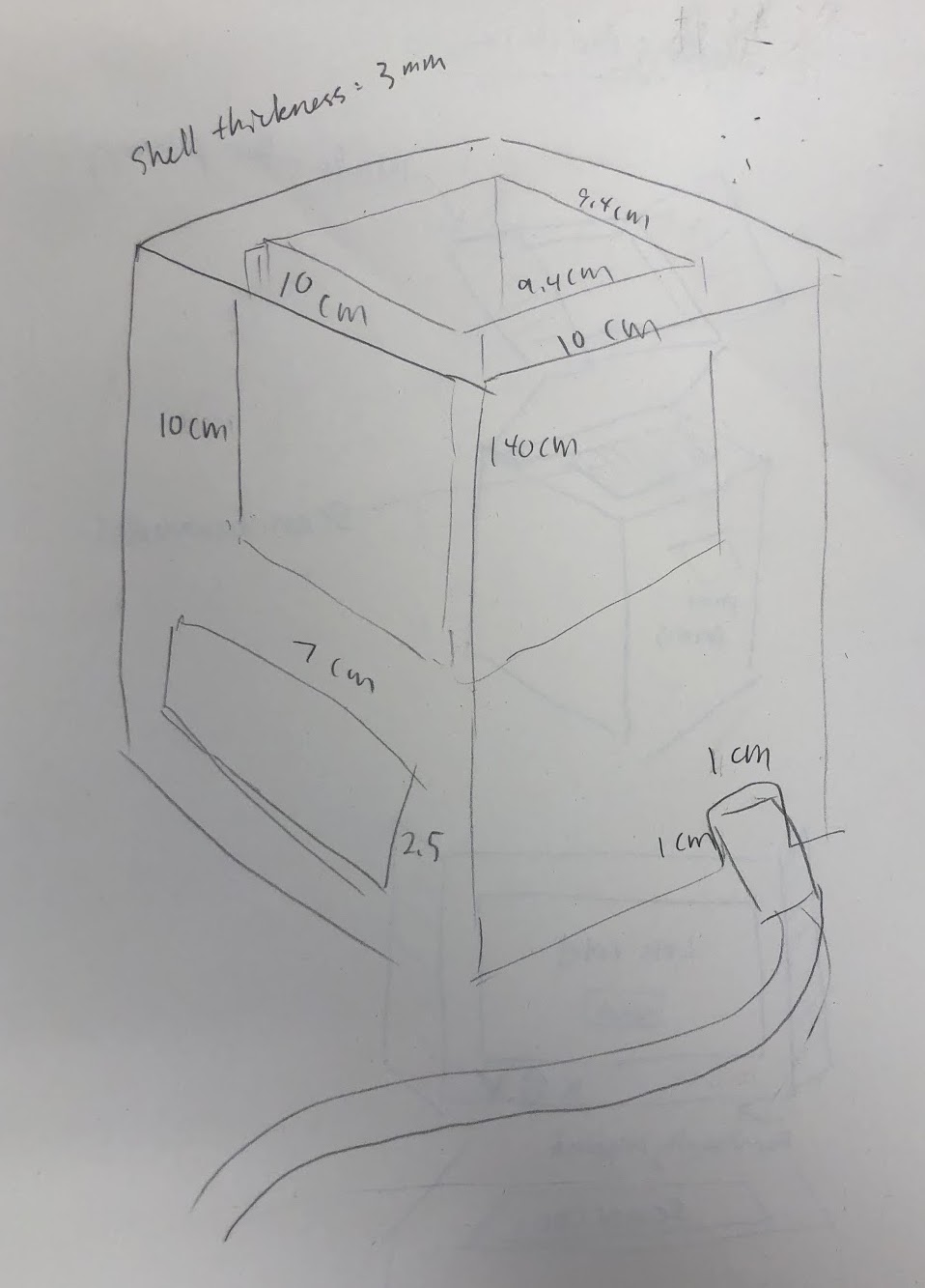
We chose a model prototype as our first implementation because it is a cheap yet effective way to plan out our design in the 3D form. First, we started with a few sketches on paper of our 3D object. Our initial idea was a box with a screen, but it could only be used as a reminder and there would be no other features or functionalities. So we brainstormed how it can be more useful for people’s daily lives. At last, we thought of merging a screen that displays reminders to a pen holder. By providing a pen holder feature, our product can be more useful and desirable for our users. Then, Melody sketched our product with placements of Liquid Crystal Display (LCD), RGB LED, and the Arduino that will be used to show messages and remind our users.
Primary sketch of Remind Holder
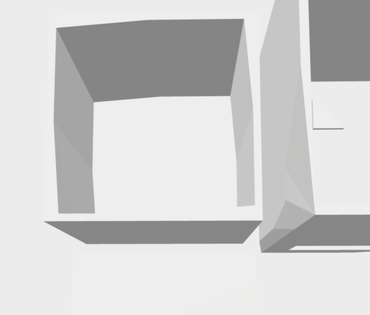
We used cardboard to make the physical product and to visualize what would be the ideal size. Melody was in charge of integrating physical computing, and she got the sizes of an LCD screen and other digital parts down. Using the sizes, I cut the cardboard to make a pen holder. Together we created a simple design that has the storage for digital components at the bottom. At the same time, we wanted it to have enough space and depth at the top to put pens. We decided to have two layers of the pen holder to place LEDs in between the walls and to separate the contents of the pen holder and electronic parts.
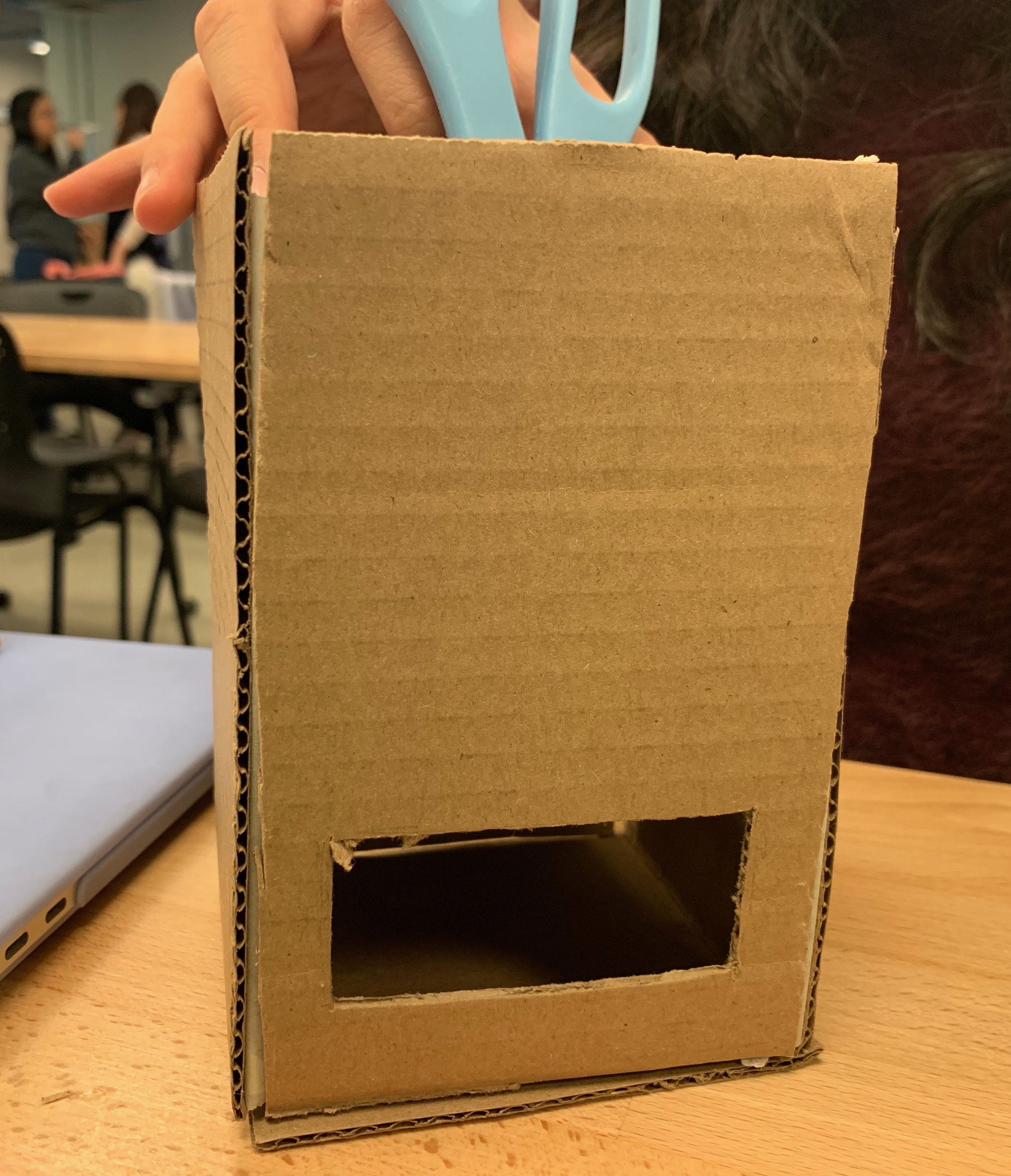
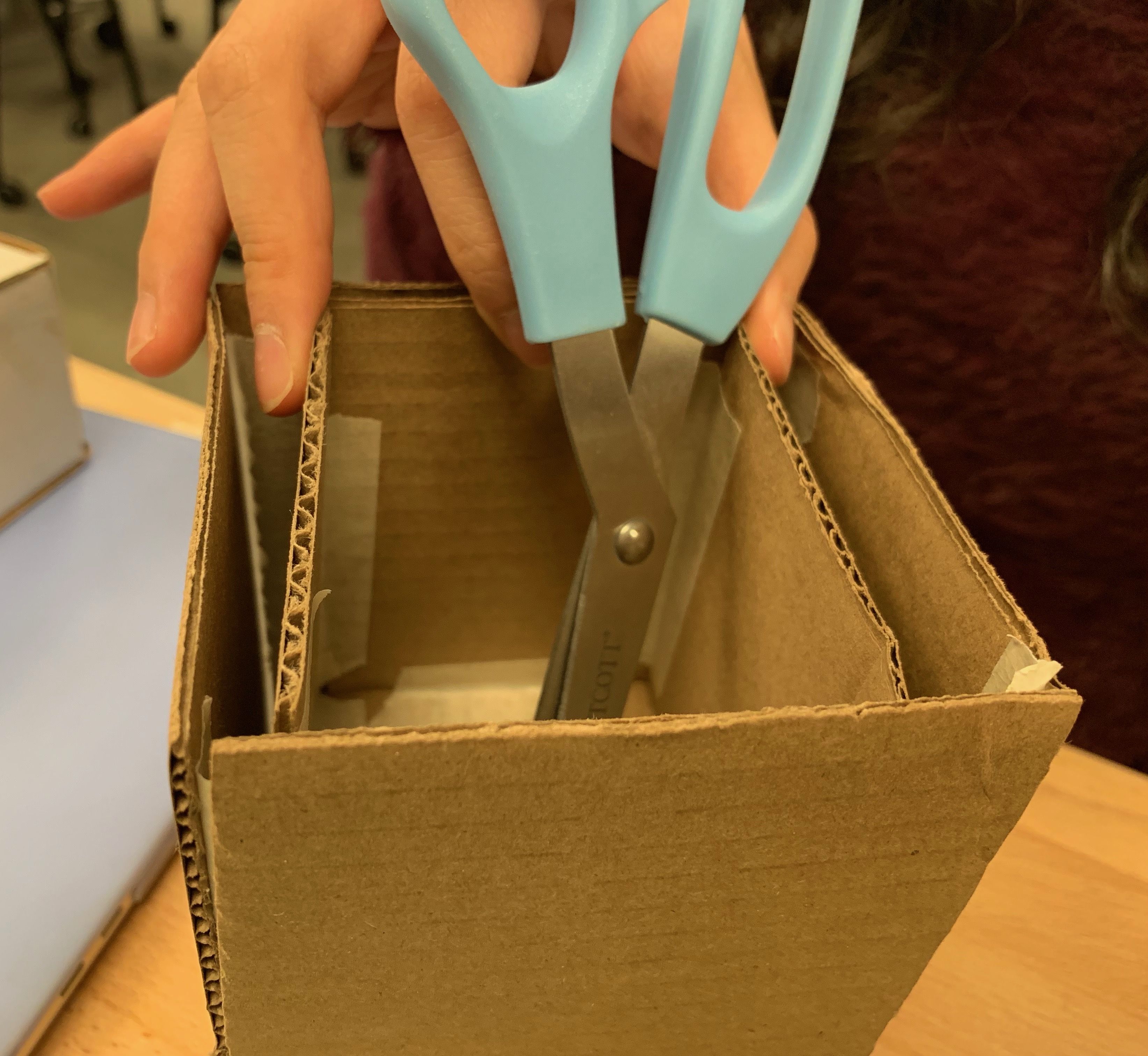
Model prototype with a window (left) for the LCD screen and two layers of boxes (right) for LEDs
Then, I designed a paper prototype of the mobile app and screen interface for the LCD screen to plan and test interfaces with the physical product before moving onto the interactive prototype. The main screen of the app has a list of reminders that is divided by days of the week. Through the add button, the user can navigate to a new reminder screen where the user can make a new reminder. New reminder screen can be extended to alert and repeat screens where the user can choose more option for the reminder.
Paper prototype of the mobile app and the LCD screen
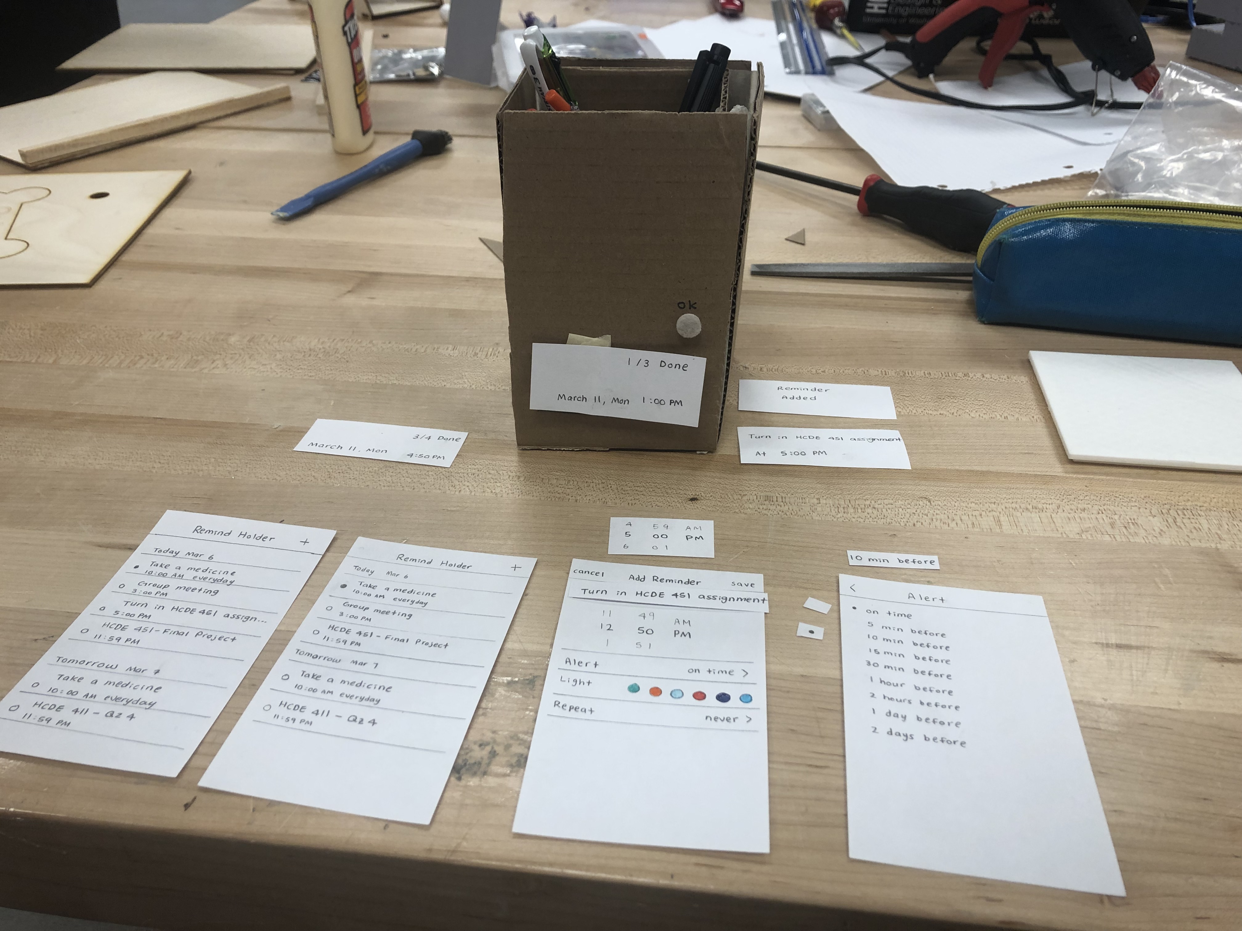
For the interfaces on the physical product, we wanted it to be simple but informative for the user. So we decided to display the time and the number of completed reminders on the day at the resting state. When the user saves a new reminder, it will project “Reminder Added” to confirm that the new reminder is also linked to the holder. At the reminding time, it will show the title and the time of the reminder.
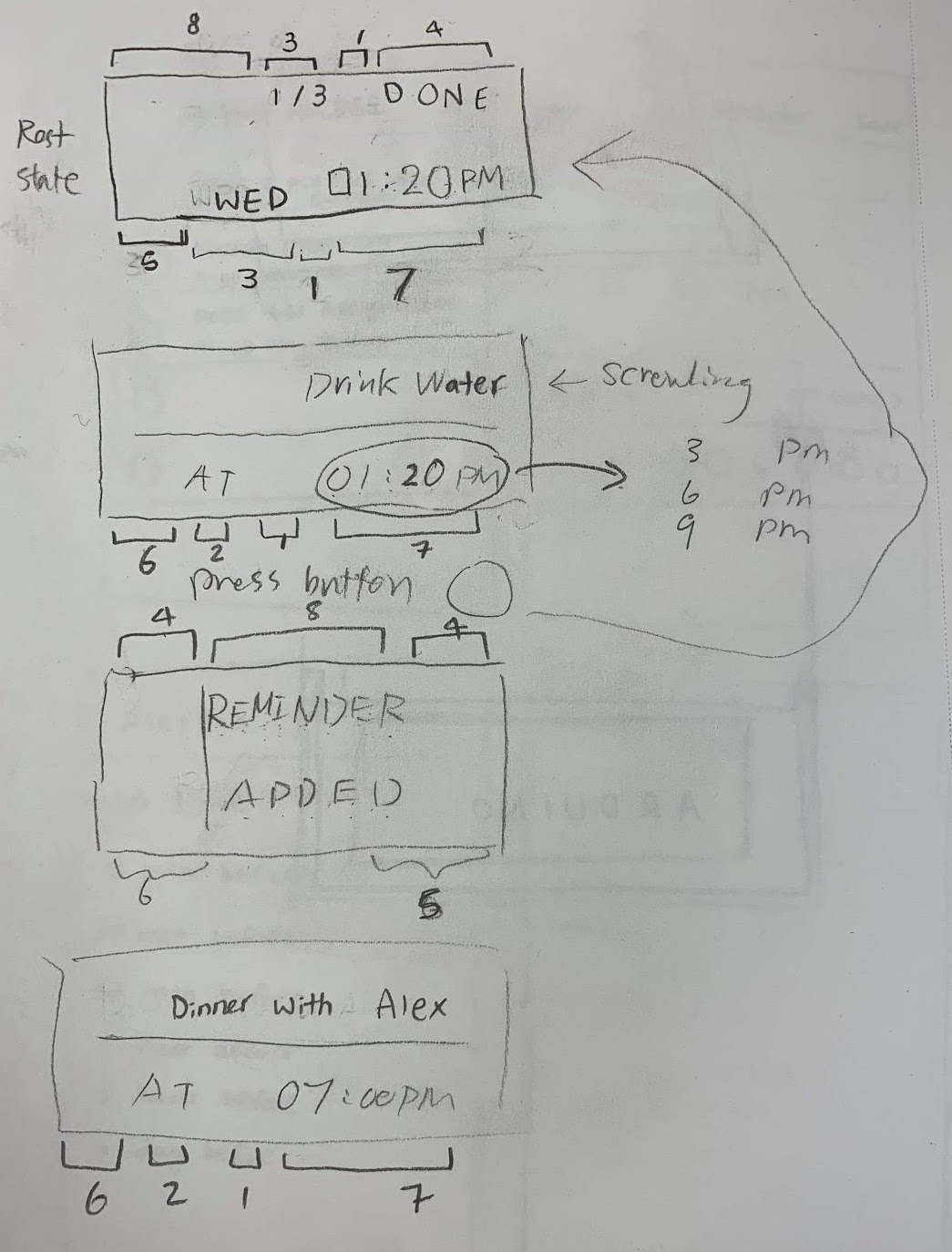
LCD screen design sketch
After designing the model prototype and paper prototype, we conducted our first usability testing to test the interaction between the model and paper prototype and get feedback on which part of the screen is hard to understand.
3D Prototype
After conducting our first usability testing on our low-fidelity prototypes, we created the 3D prototype that has a higher fidelity to provide the closer feel of the final product. We made a quick sketch of the model with exact measurements of the product. As anticipated, there were a few complexities in creating the 3D prototype. When designing the 3D model using Rhino, there was a problem of not showing fillet edges when converting to an STL file. So we redesigned the model without fillets. In the printing stage, we faced the limitation that the 3D printer cannot print for more than 15 centimeters tall. We had to come back to our design again and trim the height down.
Sketch with exact sizes
STL file of the first trial that was not able to be printed
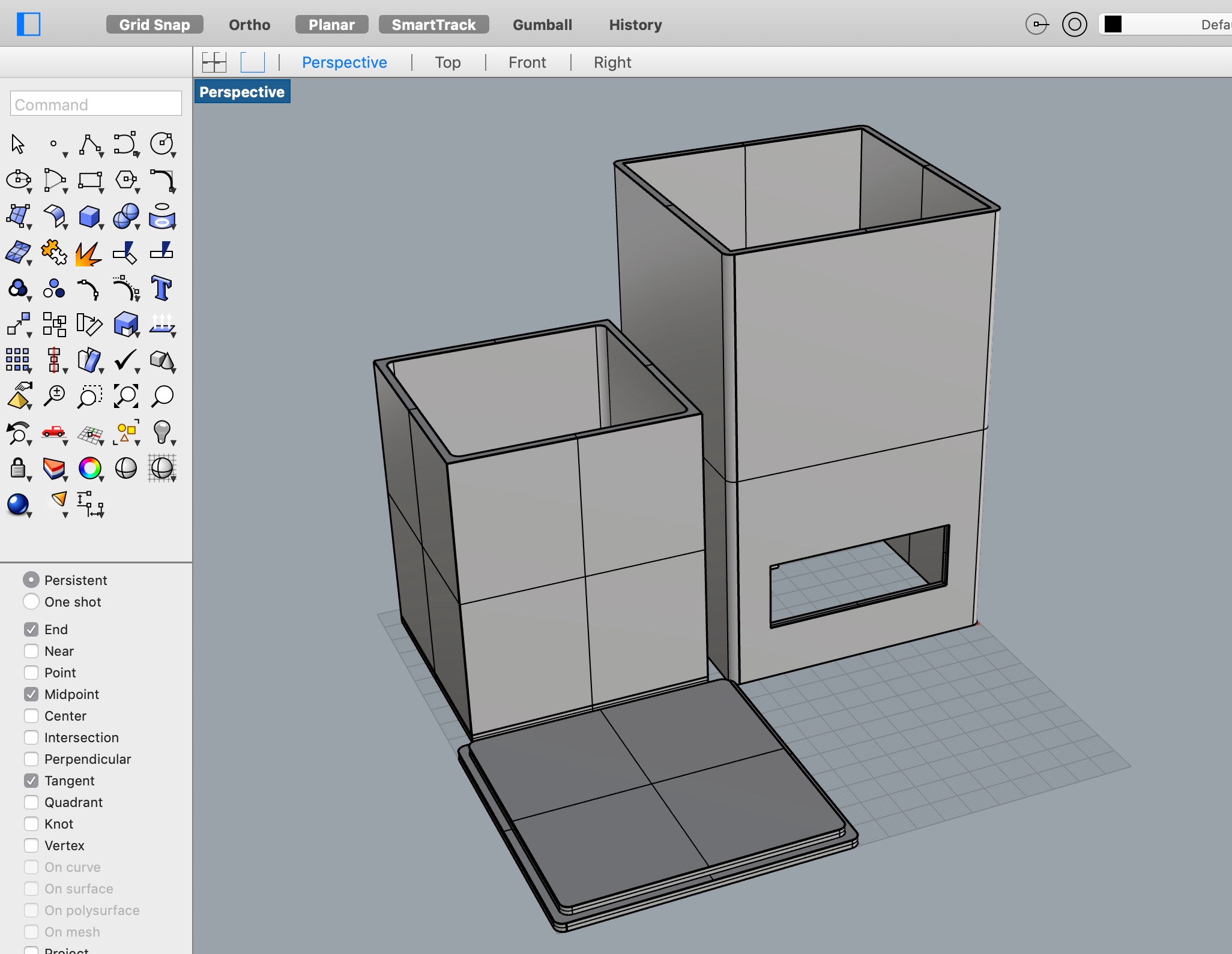
Final design in Rhino
We also faced the problem of not having white filament at the 3D printing station (white is necessary for the LED colors to come through). So we waited for the white filament to come and distributed our time to print on two different days. We printed the inner box and the triangle supports first with a green filament on the first day and the outer box and the lid with a white filament on the second day. At last, after a total of 20 hours in 3D printing, we were glad that the two prints were successful. We ensured an enclosure that was able to integrate all the components.
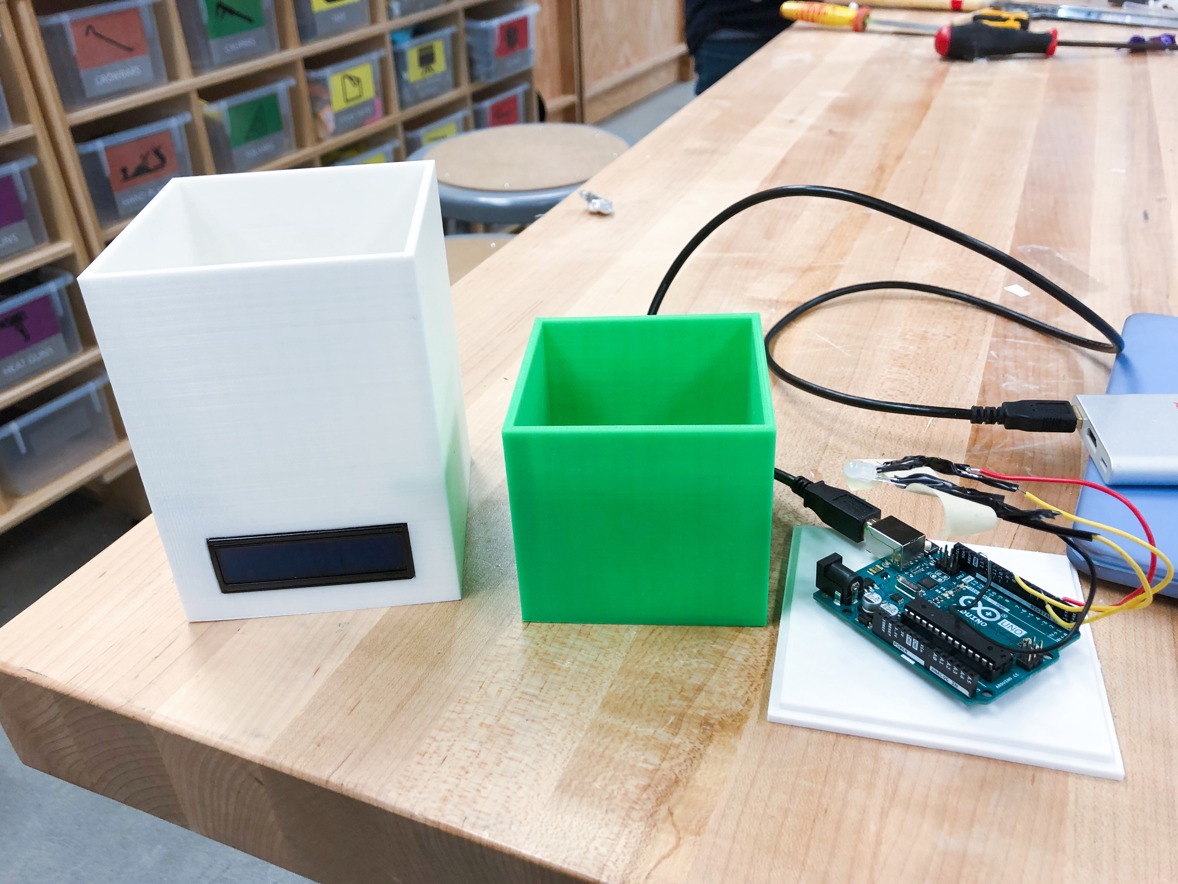
Physical components of the 3D prototype
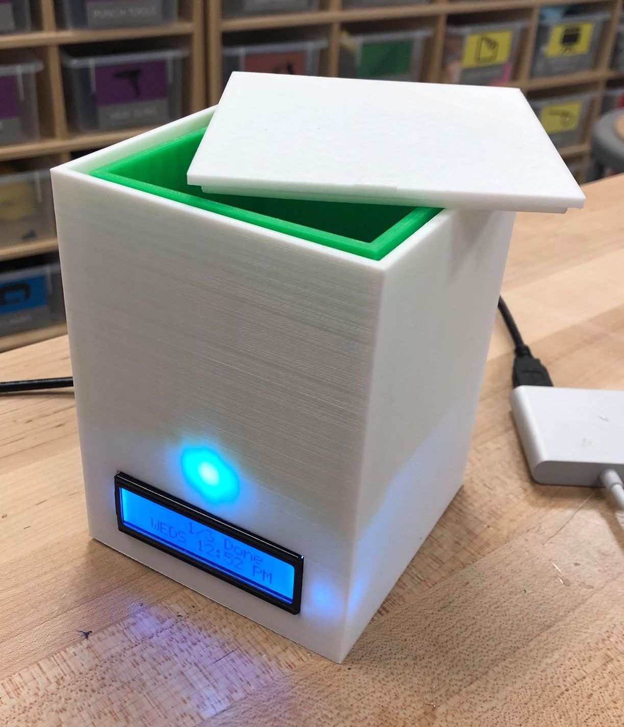
Final 3D prototype in resting state
Initially, we planned to have single-color and bi-color LEDs to be in between the walls, but it was inefficient and the lighting was not showing through the walls. Later, we decided to use one RGB LED to reduce the number of single color LEDs. We decided to have the LED go behind the walls for a more ambient and friendly look. We also tested that the LED color came out the best when it is perpendicular to outer walls.
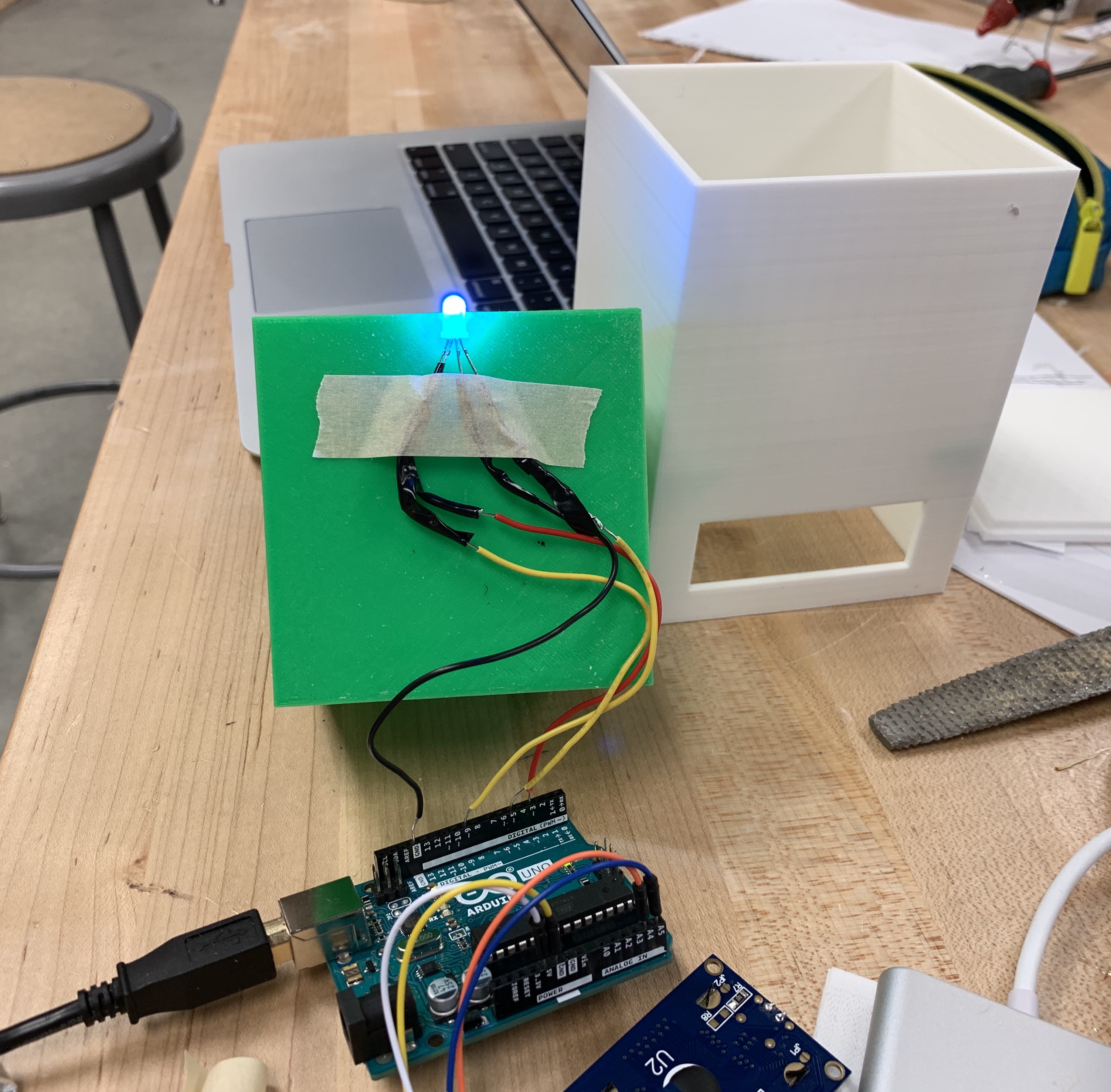
RGB LED placed under the inner box
Interactive Prototype
For the mobile app, I designed a wireframe using Sketch. Based on the feedback from the first usability testing, we learned that the new reminder does not allow the user to choose a date to set the reminder. And our participant suggested that it would be better to set 15 minutes before on the alert to be a default because people usually want the reminder to alert them ahead of time.
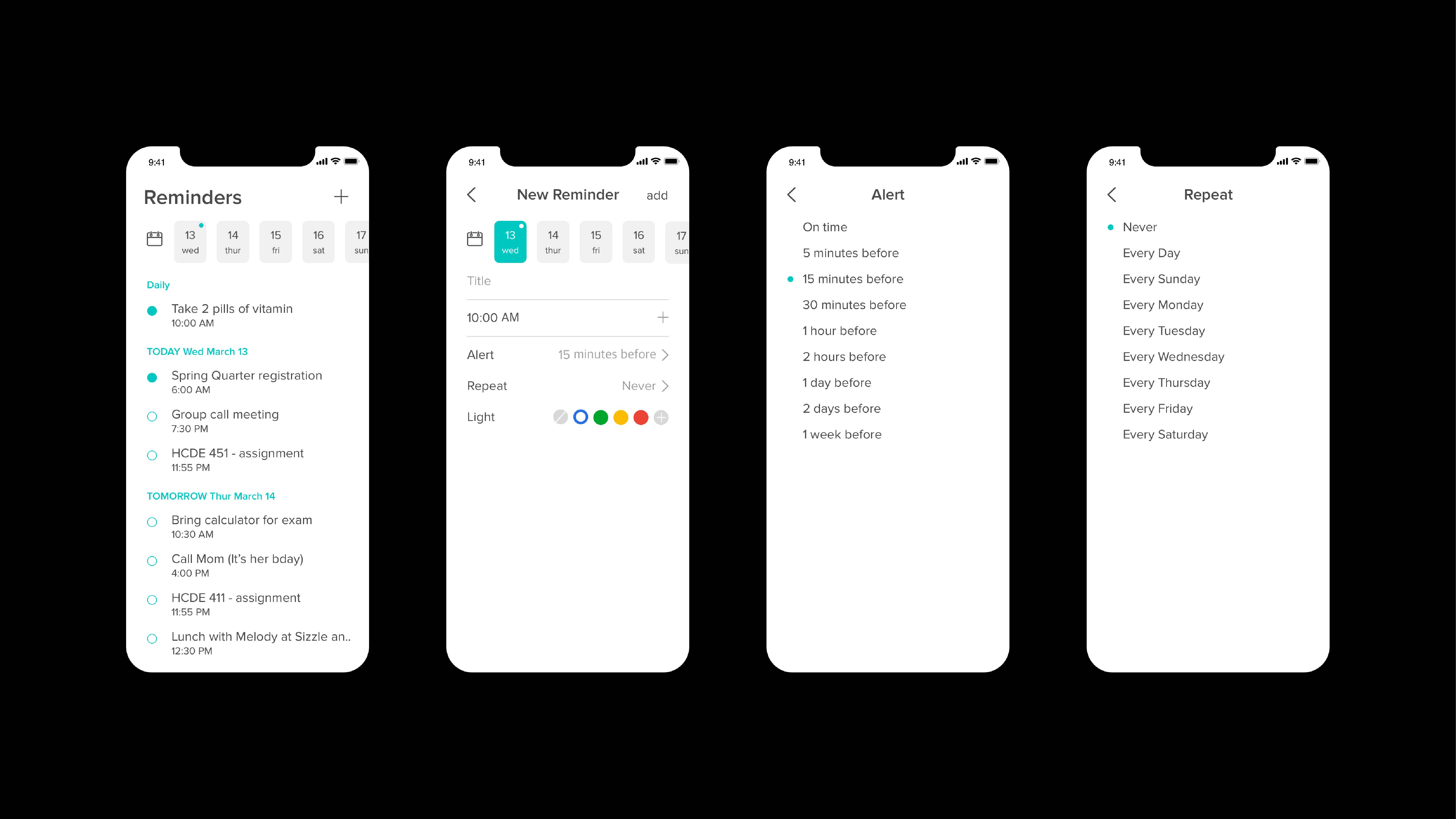
Four main screens in the mobile app
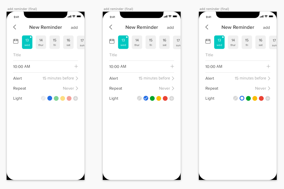
New reminder screens with different indicating ways on the color
In the new reminder screen, we had several trials in the light option in how to differentiate the selected color from others. We first used an opacity of the color to indicate the selected color as shown in the left screen in the photo above. The opacity of unselected colors was in 50% when that of the selected color was 100%. But when we mirrored the screen through our phone, the colors with 50% opacity seemed as if they are pastel colors. So we tried a check icon on the selected color. But putting a check icon on the no color, which is the first circle on the circle list, seemed too crowded inside the gray circle. Then, we tried to put a smaller circle inside the colored circles. And it was easy to differentiate which color is selected. So we chose the last trial to indicate the selected color for the light.
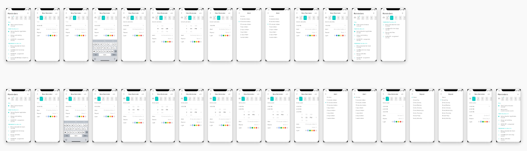
All screens of two tasks for the second usability testing
After finishing the four features, I made all the screens for two tasks to conduct usability testing using both 3D prototype and the interactive prototype. We wanted to make our wireframe to be interactive, but due to lack of time, we exported all the screens to use it for usability testing.
TESTING AND EVALUATION
We ran two usability tests to check our product's ease of use and appeal. The first test focused on the initial concept, using model and paper prototypes. Participants succeeded in creating a reminder for a dinner tomorrow at 7 pm with a 30-minute advance notice as a yellow light. Feedback included a desire for more date flexibility and a preference for 15-minute advance alerts.
Usability was assessed via task success and participant feedback. Desirability testing was postponed due to the early development stage, yet participants were eager for a more advanced product. Using insights from the first test, we upgraded the interaction prototype by adding a calendar to the mobile app for date selection. New reminder alerts now default to 15 minutes before the set time.
In our second usability test, participants rated product desirability and usability. Usability averaged 3.86 on a 1 to 5 scale, while desirability averaged 4. Participants appreciated our product's intent but felt they weren't its ideal users, being college students who frequently move. They suggested its value in office settings, particularly for desktop users. One participant found the "2/3 tasks done" display confusing initially, while another noted unclear mobile interfaces for consolidating daily tasks in one reminder. The latter felt restricted from checking tasks individually under the same reminder.
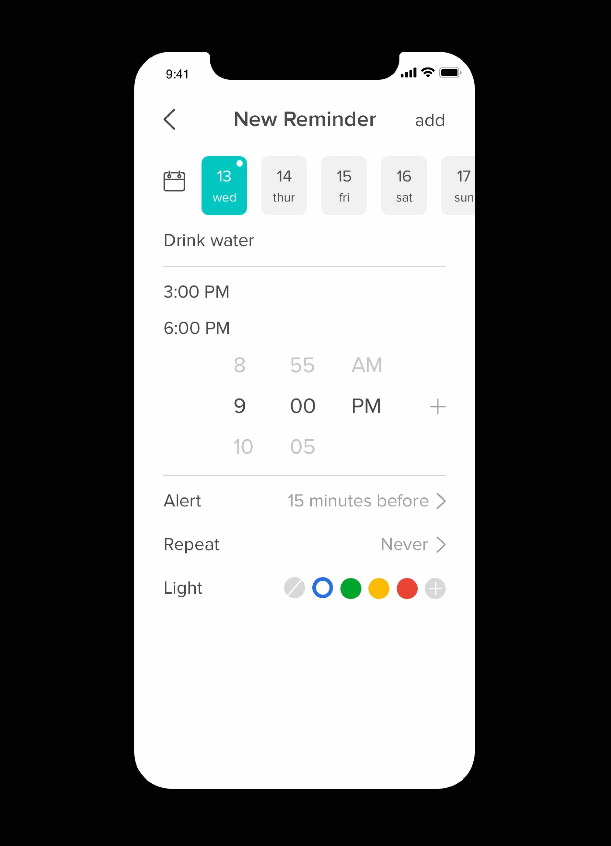
Adding three-time slots in task 2
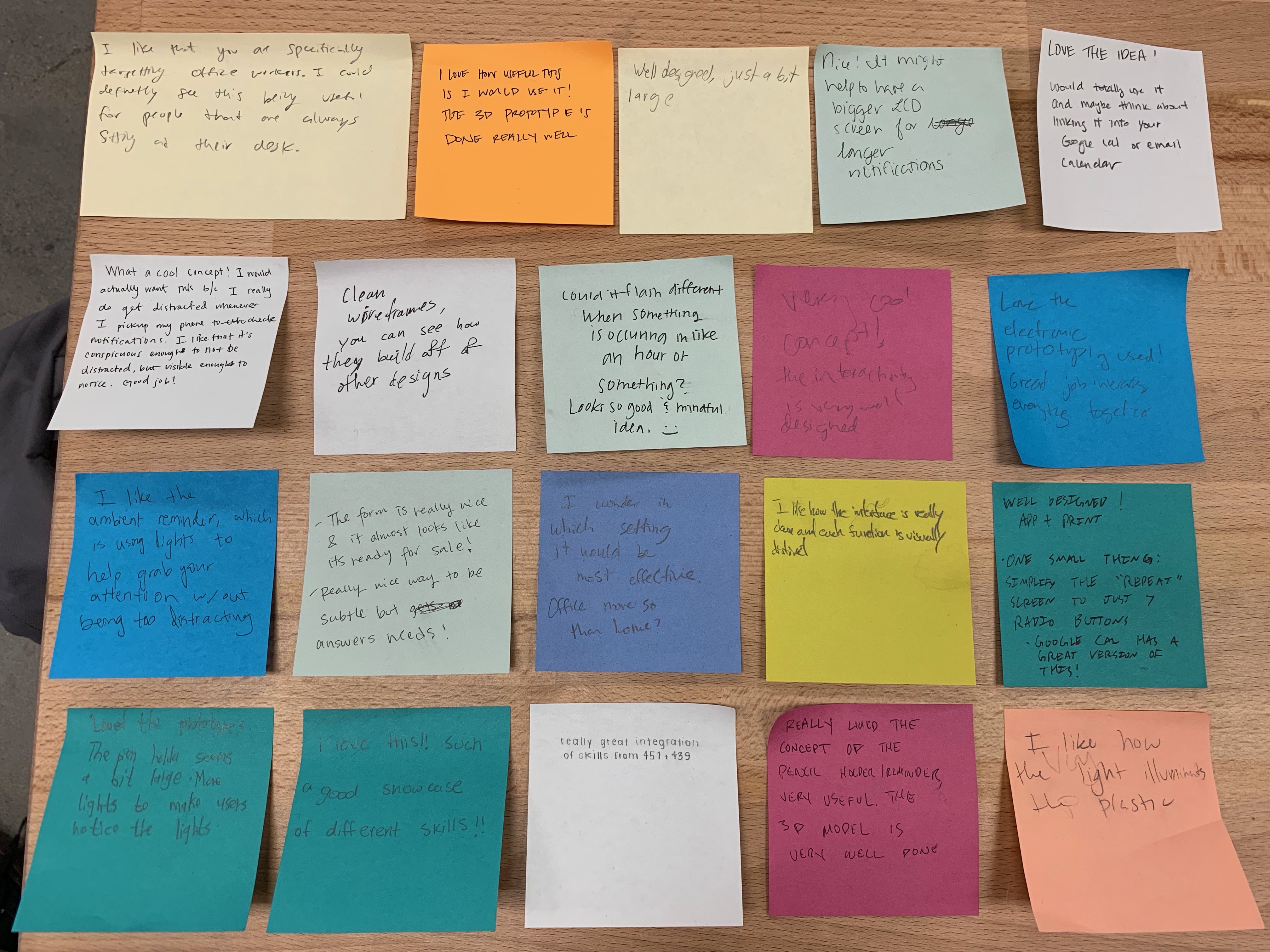
Feedback from the colleagues in class presentation
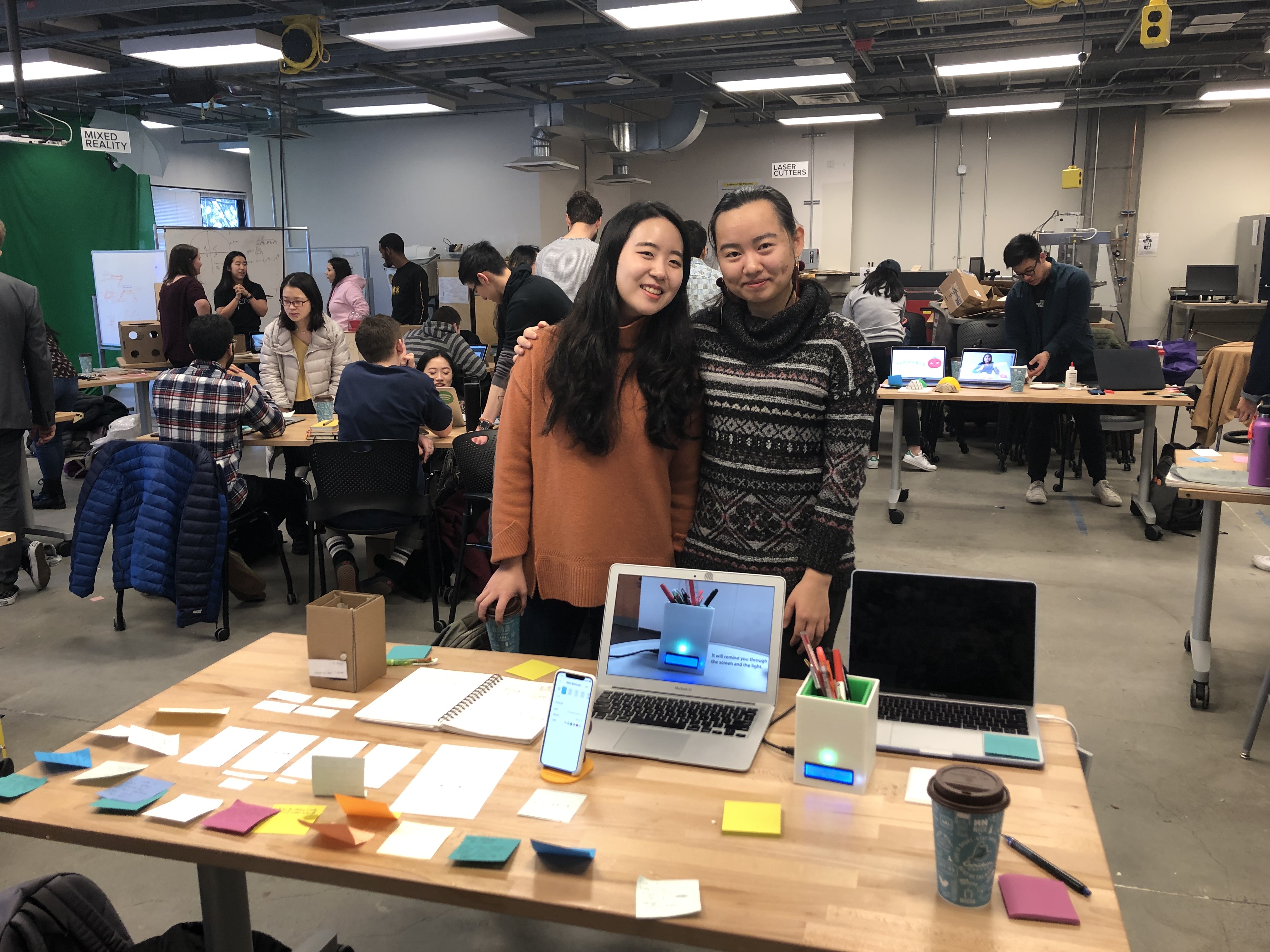
Two designers of Remind Holder
Continuously refining the product would involve shifting our target users to office workers stationed at desks for extended periods. Enhancing modularity, users could customize the desktop object's form for versatility, like using it as a flower pot or storage. To elevate usability, incorporating a touch-sensitive screen for added gestures (swiping for task history) is contemplated. Aesthetic improvements encompass substituting the LCD screen with touch-responsive LEDs. Expanding user base involves exploring Google Calendar integration for task display on the device.
See More
CleaveryDoor-to-door Laundry Service
Find in StorePersonalized In-Store Shopping
Pear OSA Foldable Mobile Device